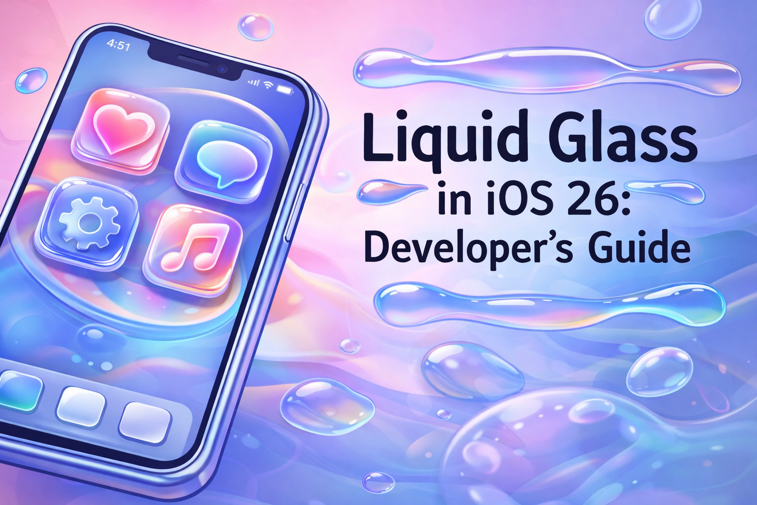
Liquid Glass in iOS 26: A Developer’s Guide to Apple’s Stunning New Design Language Summary
Chau
The Dawn of Liquid Glass: A New Era for Apple Interfaces
At WWDC 2025, Apple surprised the developer community by moving away from the flat, minimalist aesthetic that defined iOS since version 7. In its place came Liquid Glass — a rich, physics-inspired design language that treats interface layers like real glass: translucent, reflective, and refractive.
The result? Apps feel deeper, more alive, and intimately connected to the device hardware. Light bends through overlapping layers, colors subtly bleed between them, and controls respond to context by expanding or fading gracefully.
[IMAGE PROMPT] iOS 26 Share Sheet floating above home screen content, showing colorful refraction and soft glow through translucent glass layers, realistic device screenshot, 9:16 aspect ratio.
Why Liquid Glass Matters
Apple’s vision is simple yet powerful: hardware and software should feel like a single entity. Liquid Glass achieves this by:
- Creating visual depth through layered translucency
- Allowing light and color refraction between UI elements
- Enabling context-aware behavior — controls enlarge or shimmer when relevant, then recede when not needed
This isn’t just cosmetic. It guides user attention naturally and makes interfaces feel intuitive and delightful.
Getting Started: See Liquid Glass in Action
To explore Liquid Glass, you’ll need:
- Xcode 26 (available via Mac App Store or Apple Developer Portal)
- iOS 26 simulator installed
Build and run any existing SwiftUI or UIKit app on the iOS 26 simulator. You’ll immediately notice changes:
- Tab bars float with soft rounded corners
- Toolbars gain subtle shimmer when touched
- System components automatically adopt glass-like behaviors
Apple did the heavy lifting for you. Standard SwiftUI views and UIKit controls now render with Liquid Glass effects out of the box — often requiring zero code changes.

Reviewing and Refining Your UI
While automatic adoption works beautifully for many apps, some layouts need small tweaks to feel polished.
Common issues to check screen-by-screen:
- Tight padding around controls that now float or expand
- Unintended glass overlay obscuring important content
- Brand colors clashing with refraction effects
- Tab bars or toolbars feeling cramped in their new floating style
Example fix: A bottom toolbar that appears squeezed can be instantly improved with extra breathing room:
1.toolbar {
2    ToolbarItem(placement: .bottomBar) {
3        HStack {
4            // your buttons
5        }
6        .padding(10) // gives glass room to breathe and expands touch target
7    }
8}
The difference is dramatic — the control feels natural, touch targets become generous, and the glass effect shines.
When You Need More Time: Compatibility Mode
Business priorities don’t always align with new platform features. Apple provides an escape hatch:
In your app’s Info.plist, add:
1<key>UIDesignRequiresCompatability</key>
2<true/>
Rebuild on iOS 26, and all Liquid Glass effects disappear — reverting to the classic iOS appearance.
Use this sparingly. Apple may eventually remove the flag, forcing adoption.
Final Thoughts
Liquid Glass represents one of Apple’s most visually ambitious shifts in years. Fortunately, adoption is remarkably straightforward for most apps, and small adjustments yield big polish gains.
Start experimenting today in the iOS 26 simulator. Your users will notice the difference — and thank you for it.
Key Points
- Liquid Glass brings real-world glass physics (translucency, refraction, depth) to iOS interfaces.
- Standard SwiftUI and UIKit components adopt Liquid Glass automatically.
- Review padding, overlays, and brand integration for optimal results.
- Simple padding adjustments often resolve common layout issues.
- Compatibility mode offers temporary opt-out via Info.plist flag.
- Context-aware behaviors make interfaces feel more intelligent and responsive.
Conclusion
Liquid Glass isn’t just another visual refresh — it’s Apple redefining how software and hardware dance together. Open Xcode 26, run your app on the simulator, and start exploring. With minimal effort, you can deliver interfaces that feel truly next-generation. Your users (and your App Store reviews) will feel the difference.
Comments
Sources
Loading posts from the same author...

FROM IDEA TO INNOVATION
LET'S BUILD IT TOGETHER!
I'm available for custom development & SaaS projects.
I thrive on crafting innovative digital solutions, and
delivering exceptional user experiences.